Using CRUX
Choosing your dataset
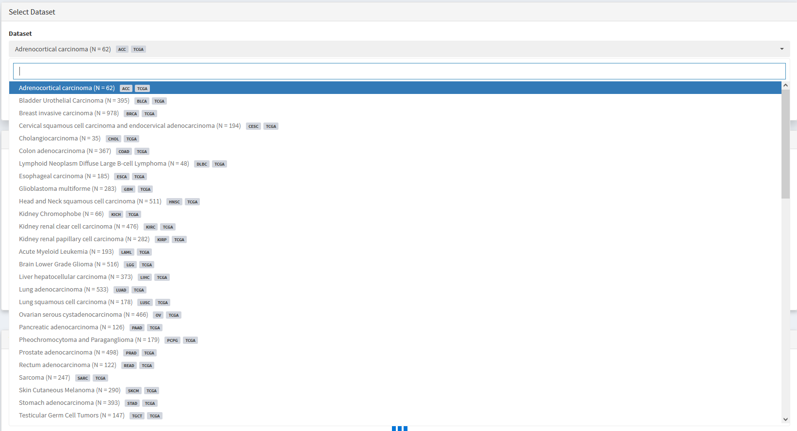
At the top of all analysis modules is a drop down menu that can be used to select a dataset of interest. By default, datasets available are from TCGA, PCAWG, or ZERO initiatives.
Custom datasets become available immediately after being imported using the import data module. See Importing Custom Datasets section for details.
Single Cohort Mode
All analyses/visualisations described below characterise a single cancer cohort.
Cohort-level mutational summaries
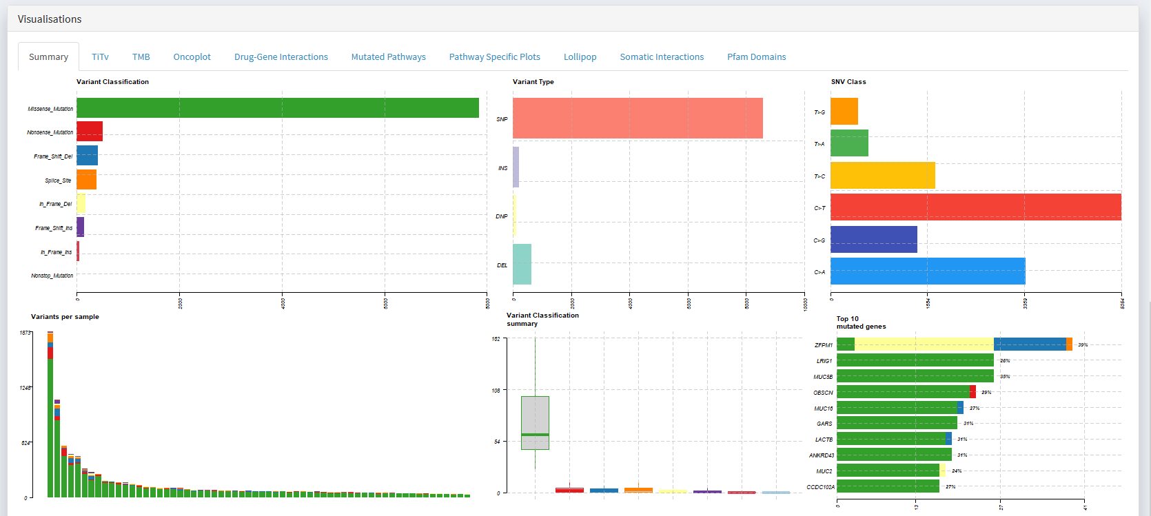
The first step in examining a dataset is often to visualise key metrics that summarise the cohorts mutational profile.
If you want to learn about:
The distribution of variant classifications (Missense | Nonsense | Frameshift | etc)
The distribution of variant types (SNP | Ins | Del)
The frequencies of each base change (e.g. A>T | A>C | A>G | T>A | etc)
How many mutations are present in each sample (e.g. to identify whether hyper-mutators are present)
The top N mutated genes
Simply scroll down to the Visualisations panel and select the Summary tab.
Creating Oncoplots
An oncoplot is one of the most useful tools available for summarising the mutational profile of a cancer cohort.
If you want to learn about:
What genes are mutated in the greatest number of samples
What types of mutations are present in these recurrently mutated genes
Which reccurently mutated genes are affected in each sample
How sample-level metadata varies with mutation status of recurrently mutated genes
How mutations found in particular samples of interest differ from others
How samples vary in the mutational status of a custom geneset
Simply scroll down to the Visualisations panel and select the Oncoplot tab.
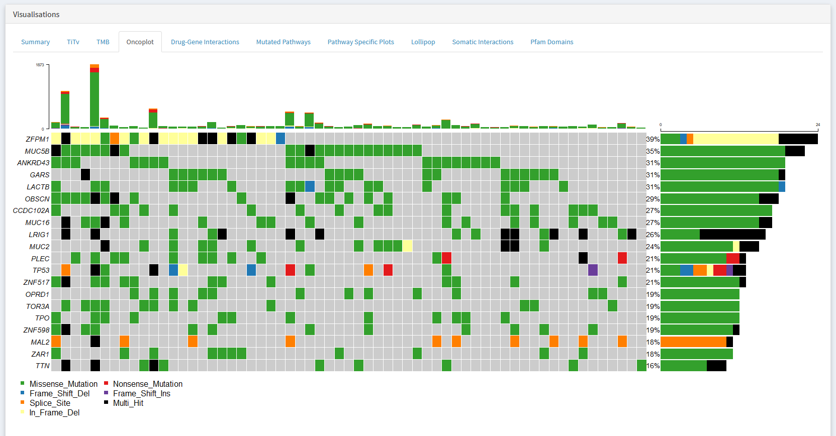
I would strongly recommend taking the time to learn how to read this plot. It is a simple yet effective method of identifying interesting genes and samples.
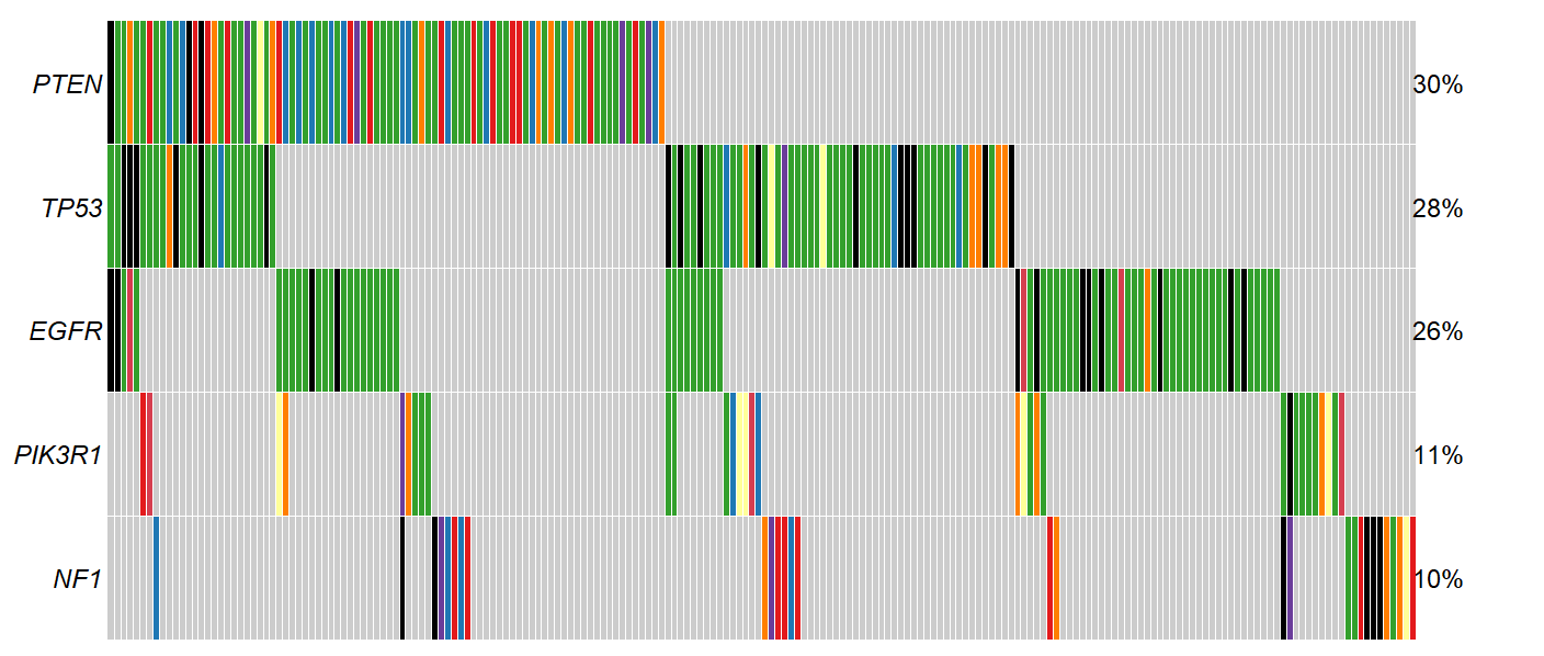
Interpretation
Each column is represents a sample. Each row a gene. The color of each square indicates whether if a gene is mutated in a particular sample, and if so, what type of mutation was observed.
In the example below, we see that ZFPM1 is mutated in samples 1-15 (39% of the cohort), while the other samples do not have a mutant ZFPM1. Further, samples 1 and 2 have a in frame deletion mutation in ZFPM1 (yellow), while sample three has a multiple ZFPM1 mutations of different types (black). All ANKRD43
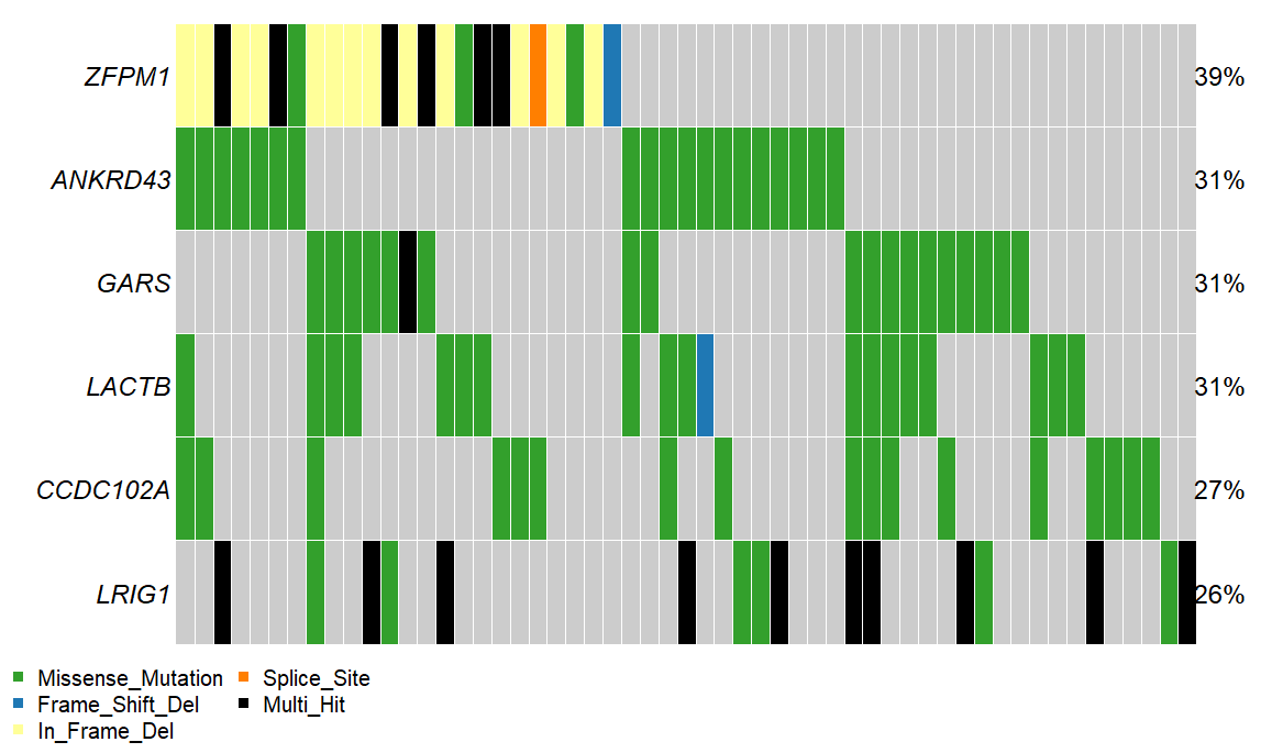
What genes are shown
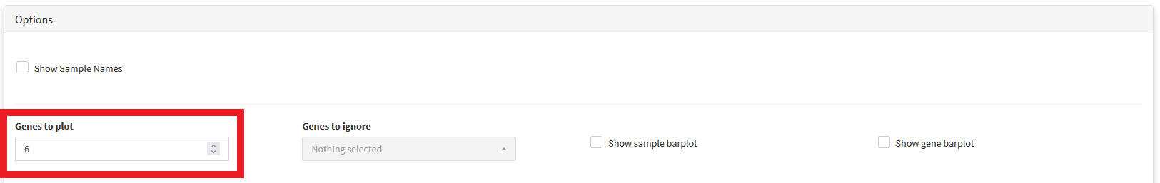
Oncoplots show only the genes mutated in the greatest number of samples. The number of genes shown can be adjusted using the Genes to plot option located in the options panel
What can we learn from Oncoplots?
The idea is that the genes most frequently mutated in a cohort have increased likelihood of being important to the disease state studied. If you’re looking at a somatic cancer dataset (like any of those available in CRUX), this idea certainly holds weight.
For example, lets examine the Glioblastoma multiforme dataset from TCGA. If we look at the oncoplot, we see known drivers of GBM disease appear near the top, including
PTEN
TP53
EGFR
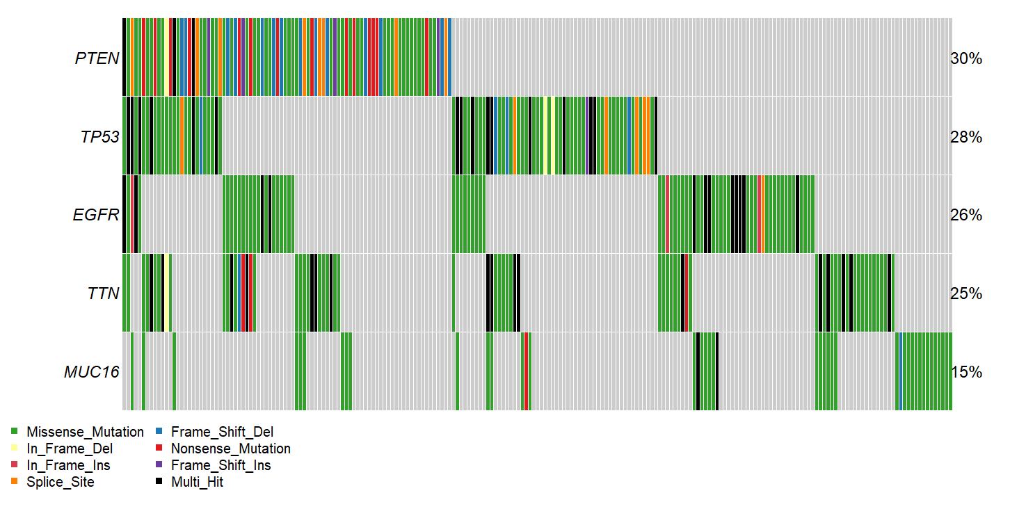
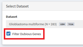
We also see some genes that are more likely to be artefacts than true disease drivers. For example, since we sort variants by recurrence in our cohort, very long genes, such as TTN can wind up sneaking their way into the oncoplot without having been specifically selected for in the tumor sample. Additionally, some genes tend to have high rates of somatic mutation completely independent of whether their in a tumor or healthy cells. These ‘Dubious’ hits can be filtered out using the option shown below. More info about what constitutes a ‘Dubious hit’ is described in the FAQ / What are ‘dubious genes’? section
New Oncoplot:
To further distinguish frequently mutated non-driver genes from genes driving disease, see Using External Analysis Platforms
Adding sample-level metadata annotations
In the options panel below the oncoplot, there is a Clinical Feature drop-down which can be used to select sample-level metadata you want to annotate samples with.
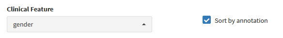
The results are shown below:
This may help you identify patterns in how sample-level metadata associates with the mutational status of commonly mutated genes
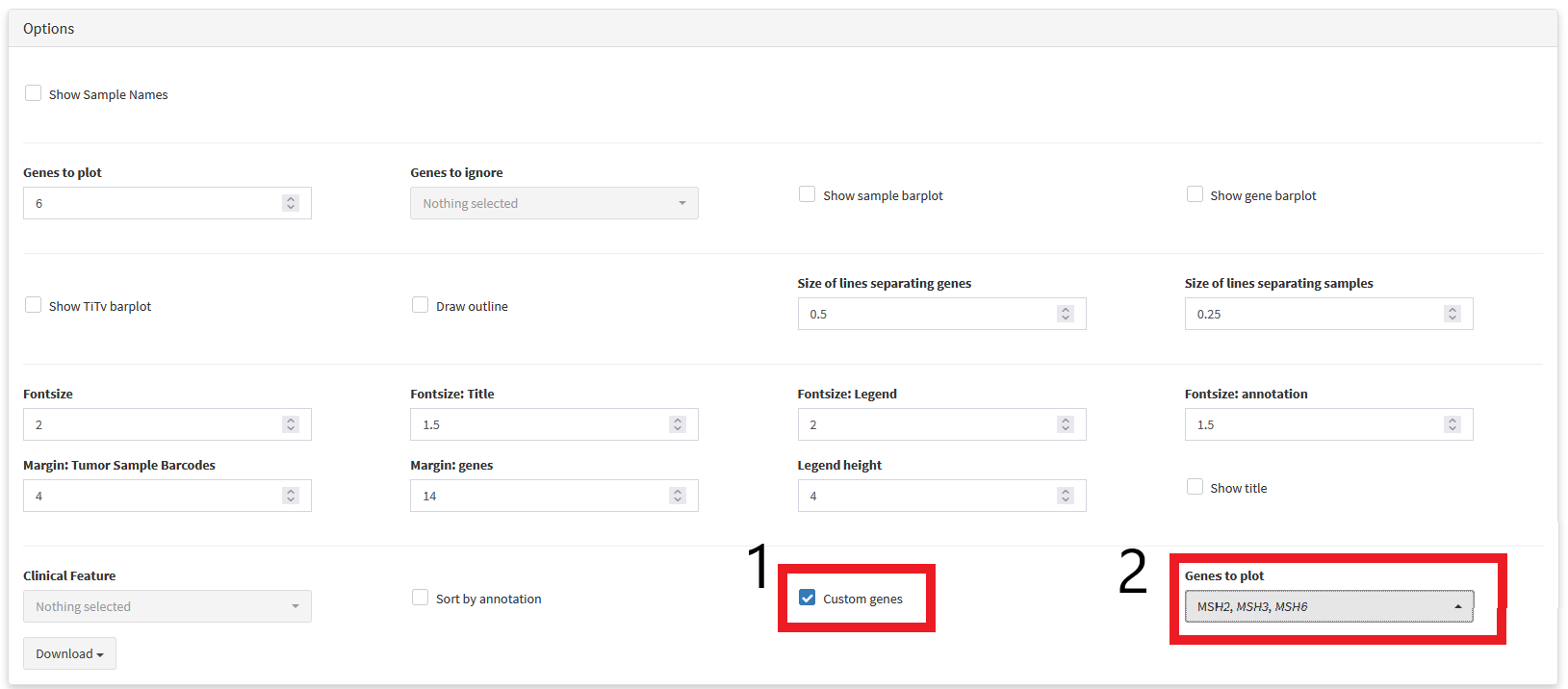
Using custom genesets
Depending on the goals of your research, you may not be exclusively interested in genes with highly recurrent mutations. For example, perhaps you want to screen a cohort for samples that have mutations in a set of genes associated with drug resistance. We can select a custom list of genes to visualise using the custom genes drop-down menu.
Somatic Coocurrence Matrix
If you want to learn about:
What pairs of genes are frequently mutated in the same samples (co-occurance)
What pairs of genes are rarely mutated in the same samples (mutual exclusivity)
Simply scroll down to Visualisations panel and select the Somatic Ineractions tab.
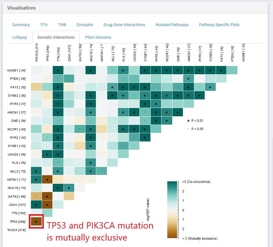
In the above gene X gene matrix, a green color indicates that the pair of genes are mutated in a lot of the same samples ( co-occurrence). Dark brown indicates that the two genes are rarely mutated in the same sample.
The above plot shows that in the TCGA breast invasive carcinoma dataset, mutation of TP53 and PIK3CA tend towards mutual exclusivity
Why might genes show co-occurrence or mutual exclusivity
Mutual exclusivity
Belong to distinct subtypes which have taken entirely different paths to developing a cancerous genome
Genes both belong a pathway that must be dysregulated, but mutation of one is enough to cause this dysregulation (no selective advantage for mutating multiple members of the same pathway)
We explore the possibility of genetically distinct breast cancer subtypes further in the section: Two-Cohort Mode
Lollipop Plots
Copy-Number Analysis
<documentation coming soon>
Using External Analysis Platforms
CRUX allows you to export data to run in many other simple to use analysis platforms. Supported platforms include:
Mutational Signature Analysis
Mutalisk
Signal
Driver Gene Identification
OncodriveCLUSTL
OncodriveFML
Cancer Variant Intrepretation
Cancer Genome Interpreter
Variant Annotation
OpenCRAVAT
Interactive Lollipop Visualisation
cBioportal Mutation Mapper
Protein Paint
Multiomics Visualisation
Xena Browser
UCSC Browser
Geneset Signature Analysis (e.g. GO analysis)
MSIGDB
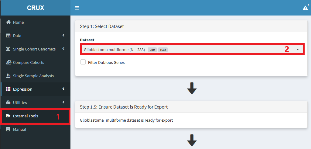
To use these tools:
Navigate to External Tools module
Select dataset of interest
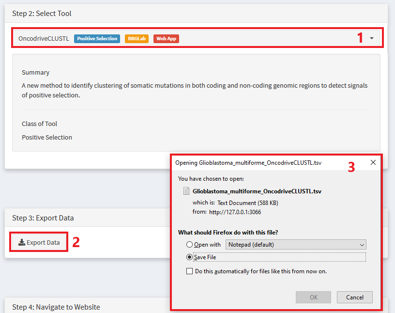
Choose the tool you want to use
Export data in the appropriate format
Save data to your computer
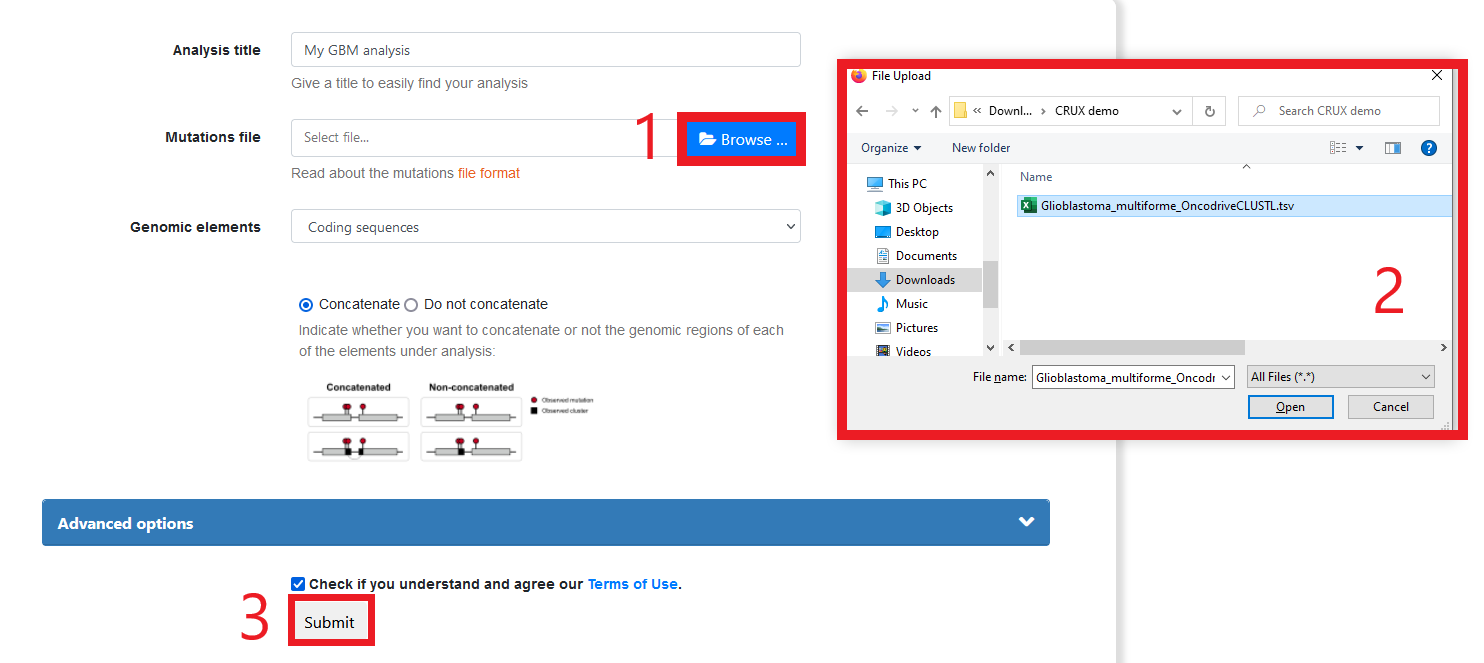
Navigate to the tools website

Follow instructions to run the required tool (for some tools, crux export module will include instructions)
Enjoy the results of leveraging an ecosystem of powerful, independently created and maintained analysis and visualisations platforms.
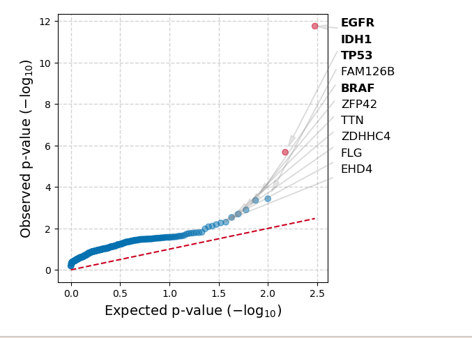
Below is an example of the results you get running the TCGA Glioblastoma dataset through OncodriveCLUSTL
Two-Cohort Mode
Two-Cohort comparison
Often, we want to identify any genomic differences between two cohorts. This can be acheived using the Compare Cohorts module
For example, maybe we might want to ask the question of what genomic differences, if any, exist between breast cancer samples that are progesterone positive and negative.
To do this in CRUX, we first use our sample level metadata to create relevant subsets of the TCGA breast cancer dataset. Check out Creating Custom Cohorts > Subsetting to see how this was done.
Once we have decided what cohorts we want to compare, we run the analysis from the Compare Cohorts module:
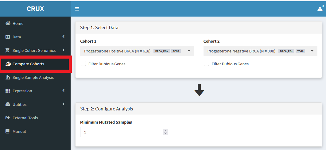
Then we just select the cohorts of interest, and scroll down to the Tabular Summary to see the results.
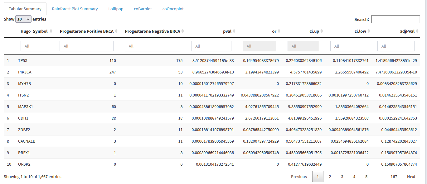
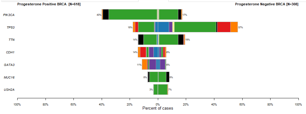
We can see that TP53 and PIK3CA are enriched for mutations in Progesterone Negative and Progesterone Positive breast cancers respectively. Looking at adjPval tells us these finding are significant at typical thresholds ( < 0.05 or < 0.01 )
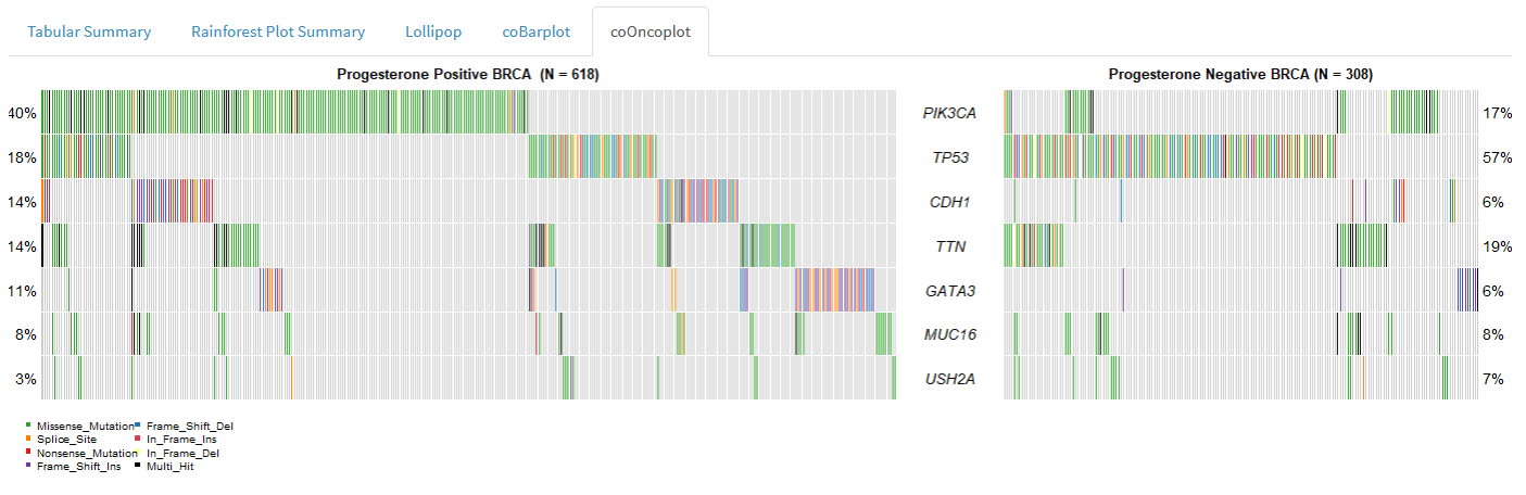
We can visualise differences between cohorts using the following plots:
Rainforest plot
Co-oncoplot
Co-barplot
What about examining variant level differences between two cohorts for specific genes?
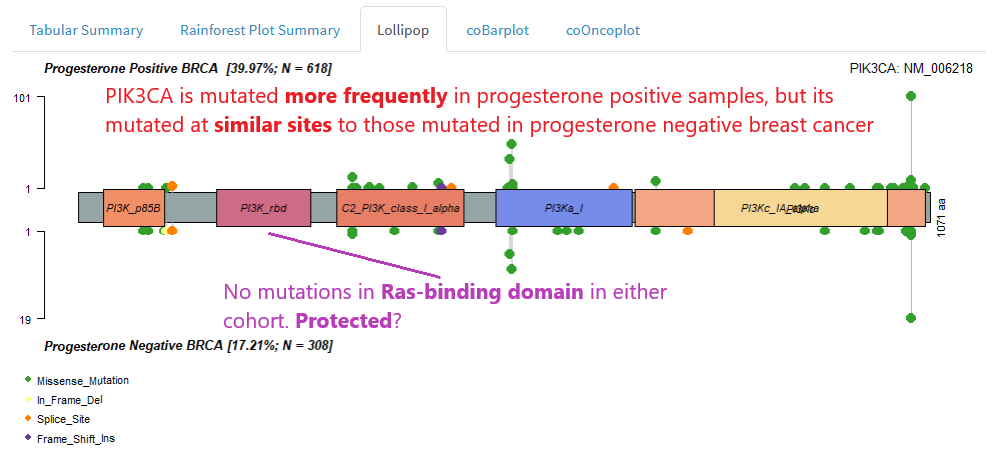
We can use the two-cohort lollipop to check for cohort-specific patterns of mutation at the gene level.
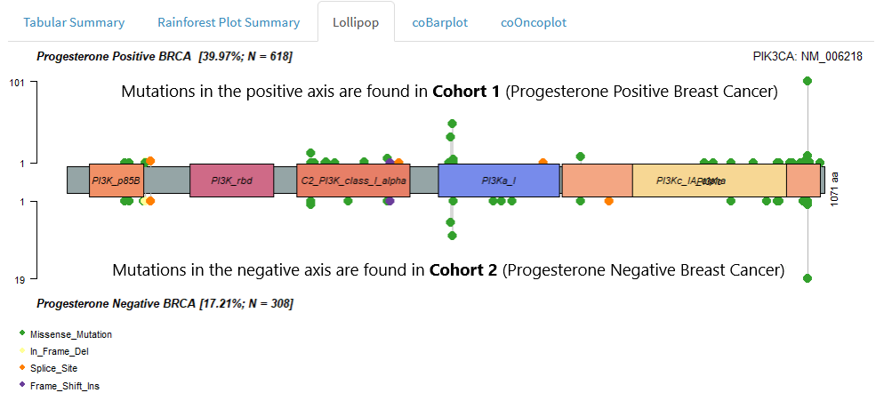
If you haven’t come across lollipop visualisations before, please read Single Cohort Mode > Lollipop Plots
We might interpret a two cohort lollipop as follows:
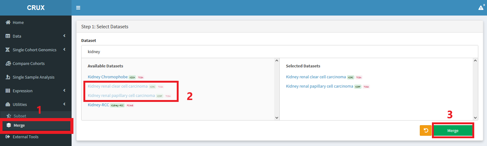
Subsetting and Merging Cohorts
Subsetting
CRUX allows users to subset datasets by:
Sample Id
Clinical Metadata
Mutational Status of a Gene
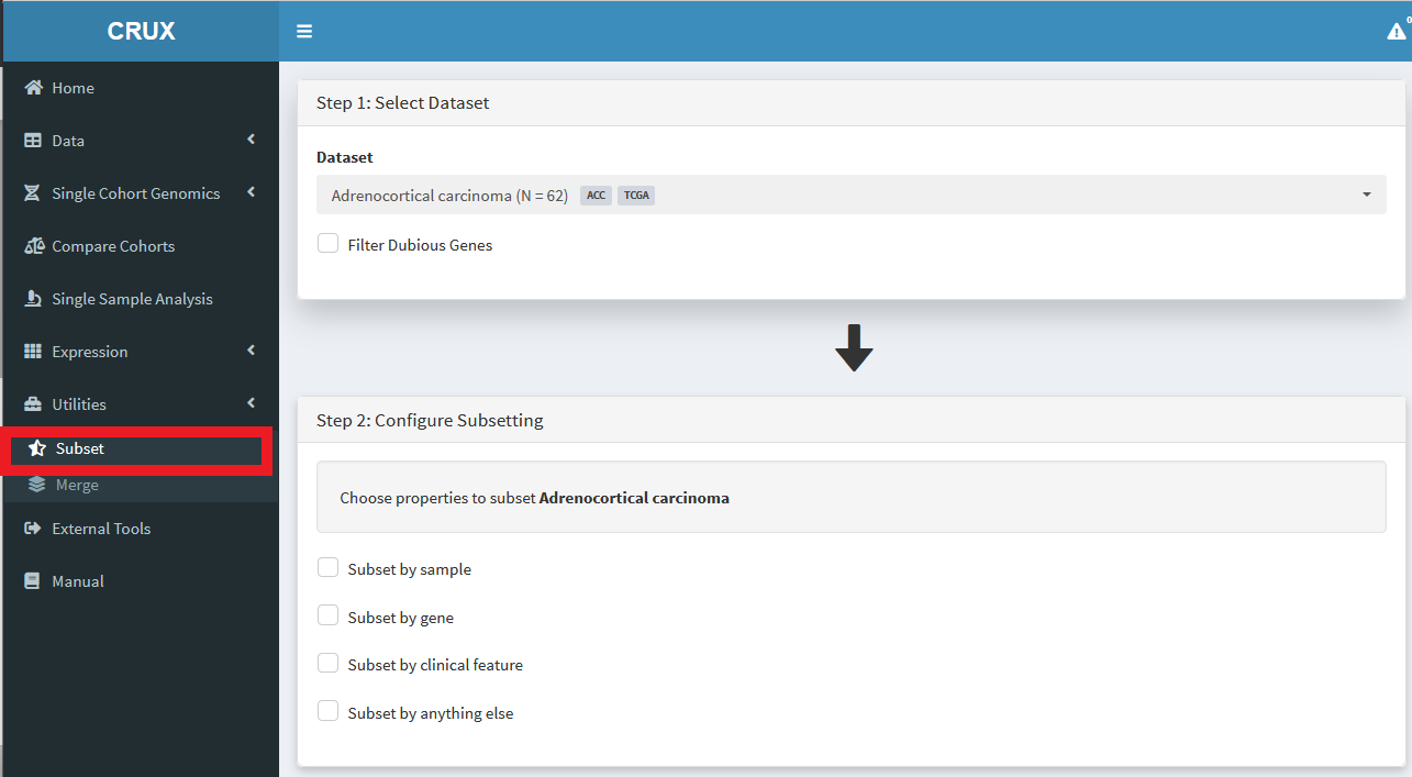
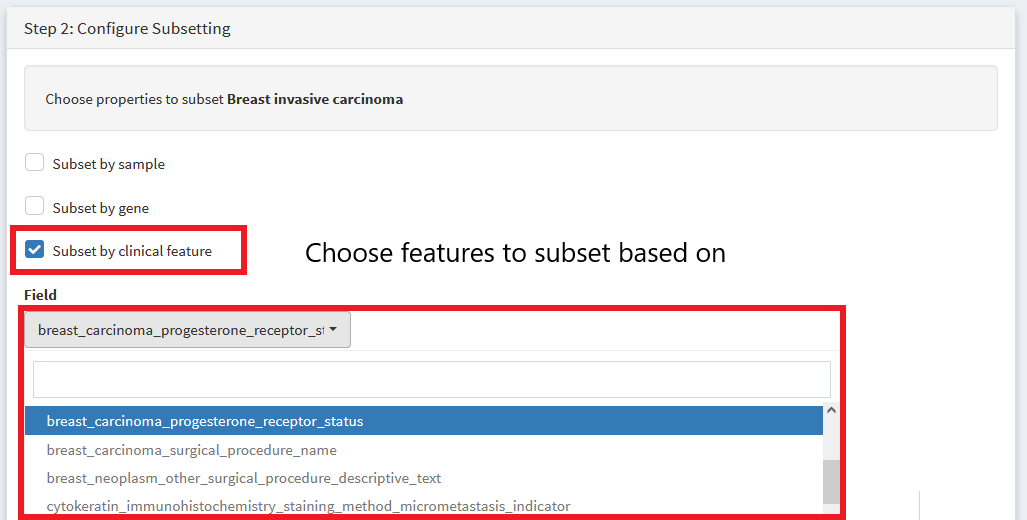
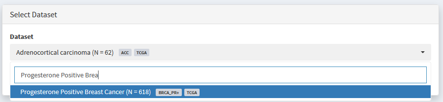
Lets run through an example. We’ll create a cohort of breast cancer samples that are progesterone positive.
First, select the TCGA breast carcinoma dataset. Then We choose variables to subset by
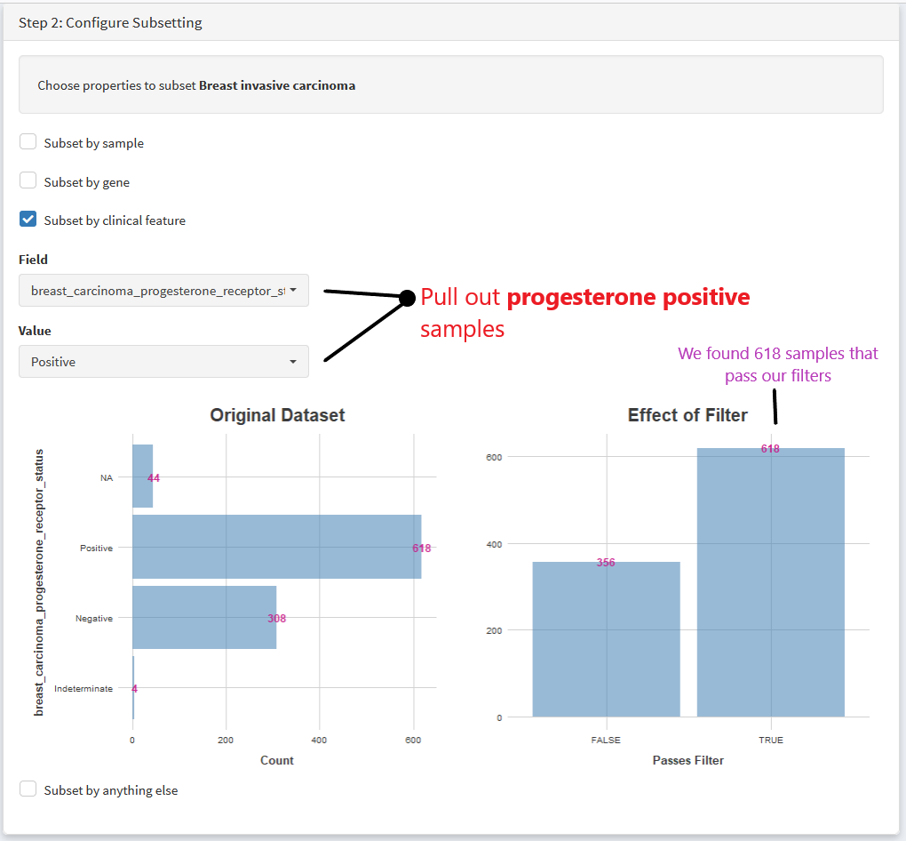
Then we specify if we want to pull out positive or negative progesterone samples
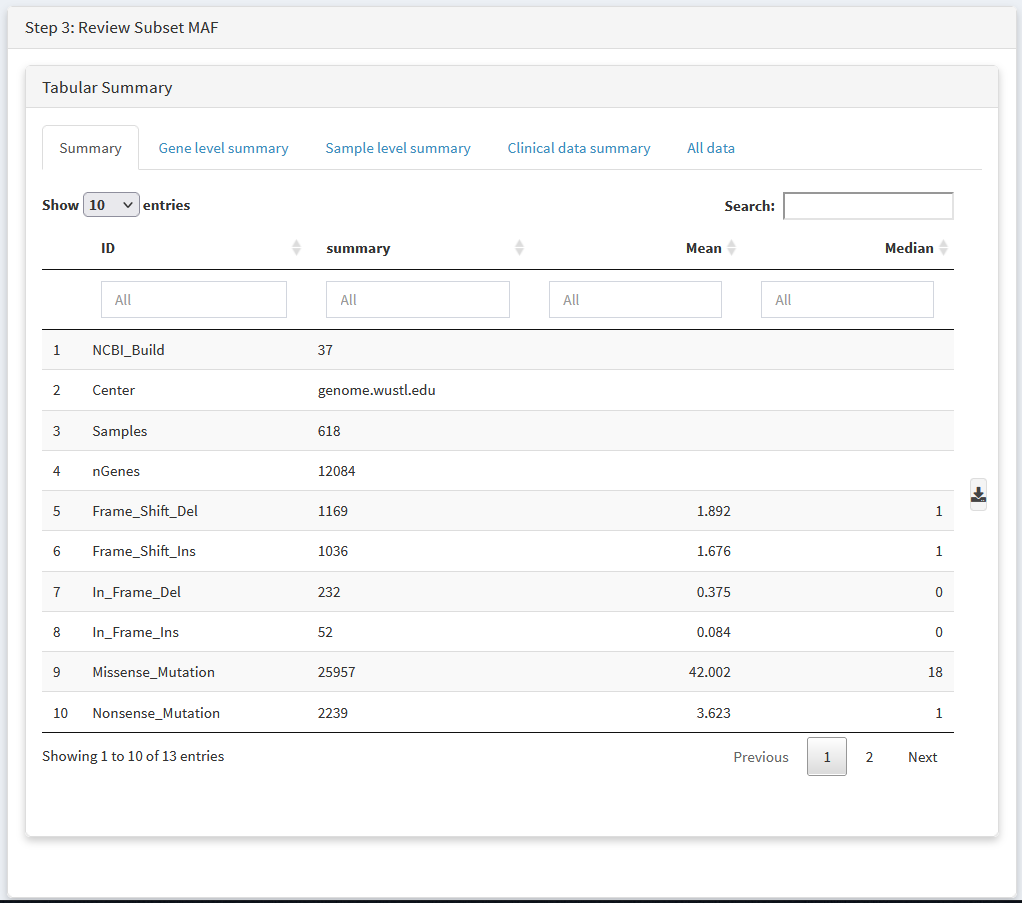
Review your new dataset using tabular summaries
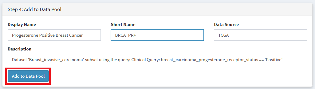
Choose a Display Name and Shorter Abbreviation for your dataset, then add it to the data pool.
The resulting dataset can be analysed like any other, and will appear in all ‘Dataset Selection’ dropdown lists
Merging
Cohorts can be merged together as follows